Ferrum & Salt

Client
Ferrum & Salt
Sector
Hardware
Services
Identity System
Year
2026
The brief/
A century-old ironmonger, re-set for its second century — identity, signage and packaging for a family hardware store.
Ferrum & Salt has sold nails, rope and kitchen salt from the same corner since 1912. The new identity keeps the counter’s plain-spoken voice — and sets it in iron.
The challenge
Three generations of signage, six different logos and an online shop that looked nothing like the store. Regulars knew where to go; nobody else could find it.
The response
One serif wordmark redrawn from the original shop sign, a two-colour palette of iron black and salt white, and packaging built from brown kraft and a single rubber stamp.

Fig. a — Primary mark in use

Fig. b — Printed matter
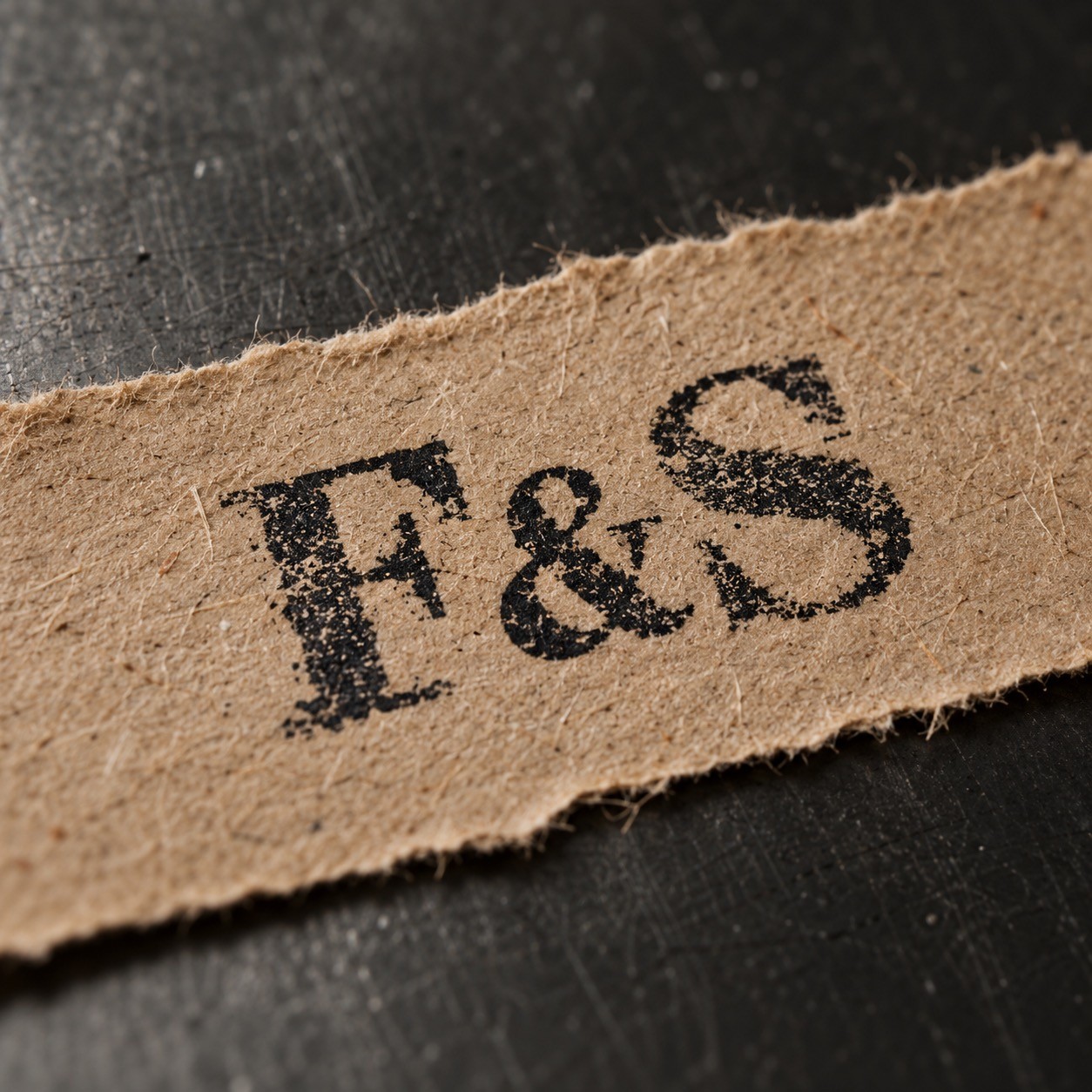
Fig. c — Detail at actual size
Next project
All work
04
—
Packaging
—
2025
Oda Ceramics
Packaging for a stoneware studio, designed so every bowl arrives as carefully as it left the kiln.
View project
